Blog Detail

How to highlight the theme inside pages of album design
2024-03-16 12:40:06
By Rani Jarkas
178 view
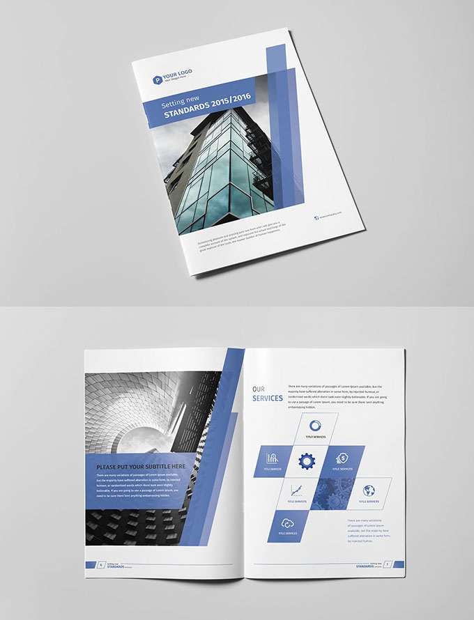
The richness of layout changes in the inner pages of the book layout is a vivid symbol of a picture album. How to enrich the layout is something that designers must do very carefully, and this richness is not only reflected in playing skills. In fact, it is more about conforming to human visual experience and visual process.
A good picture album layout should be like this: first tell everyone what kind of theme it is, then what kind of tones are used to match the theme, and then the richness of details, such as the arrangement of text, the assistance of pictures, and finally It’s time to play tricks, what kind of style to use to make the theme more prominent, what kind of auxiliary patterns to use to make the picture fuller without taking away from the theme of the text, and then add a suitable header and footer, so that the whole The picture, that is, the layout of the entire picture album uniformly conveys the meaning of the content, and clearly tells everyone what role this picture album has.
The editor below will briefly talk about the very effective album layout done by our predecessors. The header for the layout of the inner pages of the album is the same one used on the cover, a very delicate theme, combined with the theme used in this article and English, separated by small vertical lines with auxiliary patterns in the middle. Next is the theme, a big eye-catching theme that occupies a quarter of the entire picture, but only has more than ten words. The theme of the album layout is simple but not simple. The main body is dark gray on the top and bottom, and green is used in the middle to highlight The font theme of “Full Nutrition Day” is the largest, followed by the subtitle, and the signature is the smallest. It is formed into a square shape with full alignment to achieve a neat effect. The typesetting of the main text adopts the standard No. 8 Yahei font used in picture album typesetting. The leading spacing between paragraphs is larger than the line spacing, and the divisions are very clear, so that it does not look difficult.
The paragraphs are arranged neatly in the center of the page, leaving enough room in the margins for people to breathe, making it feel very relaxed. At the bottom are pictures, which are used to embellish the whole article. They use smiling faces to express health, and they are smiley faces of different skin colors and different races. They are the same size and have the same gaps. The proportion of each picture occupied by the smile is similar. Gives people a peaceful harmony. The size of the smiley face image is also consistent with the width of the text, making the entire article look like a square, neat square.
The bottom is the page number. Simple numbers and short answers in English complete the layout of this single-sided album. From the overall view, the picture is composed of a small square for the title above and a large square for the main text and auxiliary pictures below. It is an orderly whole. This is One of the album layouts that conforms to human visual experience and visual flow.
Leave a comment
Copyright © 2024-2030.Rani Jarkas All rights reserved.
